
What is a Content Management System (CMS) in Web Design?
Defining Content Management System (CMS) A Content Management System, or CMS, is a software platform that enables users to create, manage, and modify content on a website without the need for specialized technical knowledge. Essentially, it provides a framework that separates the management of design and content, allowing users to focus on the visible aspects of their website while handling all the technicalities in the background. Core Features The primary functionality of a CMS in web design revolves around its content management capabilities which include text editing and multimedia support. Users can add, format, and publish content such as blog posts, news articles, and videos using an intuitive interface similar to word processors. Most systems also offer various plugins and templates that help enhance the aesthetic appeal and functionality of websites without needing to code from scratch. Types of CMS Platforms There are numerous CMS platforms available today catering to different needs ranging from personal blogs to large-scale enterprise websites. WordPress stands out as one of the most popular choices due to its ease of use and extensive customization options provided by thousands of plugins and themes. Other notable systems include
read more →
What is the Role of Color Psychology in Website Design?
Understanding Color Psychology Color psychology is the study of hues as a determinant of human behavior, and its application in website design can significantly affect how users perceive a site. Colors have the power to evoke emotions and elicit responses, which can be leveraged to enhance user experience and influence actions on a website. By understanding what different colors symbolize and how they impact mood, designers can create more effective and appealing websites. Initial Impressions Matter The colors used on a website are among the first things noticed by visitors. This initial impression can set the tone for their entire experience on the site. A well-thought-out color scheme can convey professionalism, trustworthiness, and credibility, while poorly chosen colors might lead to disengagement. For example, blue tones are often used by financial institutions as they evoke security and stability. Enhancing User Experience Beyond first impressions, color schemes contribute to usability by differentiating elements like buttons or links, guiding users through interactions intuitively. The choice of contrasting colors can highlight calls to action or important navigation elements, making them easy to find and use. This not only improves aesthetic appeal but also enhances
read more →
What is User Experience (UX) Design in Website Development?
Understanding User Experience (UX) Design User experience (UX) design is a crucial aspect of website development that focuses on the overall feel of the experience, rather than just the look of the site. It aims to make websites not just functional but also enjoyable and easy to use. By considering the user's interactions from their first visit through to becoming a regular customer, UX designers strive to create an intuitive, user-friendly interface. The Role of UX Designers UX designers are tasked with understanding the needs and behaviors of users. They use this knowledge to craft products that align with those expectations. This involves extensive research, including user interviews and usability tests, which help them gain insights into user preferences and pain points. The ultimate goal is to bridge the gap between how things work and how users think they should work. Core Components of UX Design At its heart, UX design encompasses several key components: usability, interaction design, content strategy, and visual design. Usability refers to making the site logical and easy to navigate. Interaction design focuses on crafting an engaging interface where elements respond to user actions in expected ways.
read more →
What is Responsive Web Design and Why Is It Important?
Understanding Responsive Web Design Responsive web design is a method of developing websites that allows them to adapt seamlessly to the screen size and orientation of the device being used. This approach involves using flexible layouts, images, and cascading style sheets (CSS) media queries. The main goal is for content to render differently depending on the device or screen size so that visitors have an optimal experience without needing to resize, pan, or scroll excessively. The Role of Media Queries Media queries play a pivotal role in responsive web design. They allow website designers to apply different styles based on the characteristics of the device rendering the site, such as its width, height, orientation, and resolution. By integrating these conditions into CSS, developers can specify which set of styles should be applied under particular circumstances. This flexibility ensures that whether a user accesses a site via smartphone, tablet, laptop or desktop computer, the website will maintain usability and aesthetic integrity. Benefits for Users and Businesses From a user perspective, responsive web design offers a cohesive browsing experience across all devices. This adaptability significantly enhances user satisfaction because it provides easier
read more →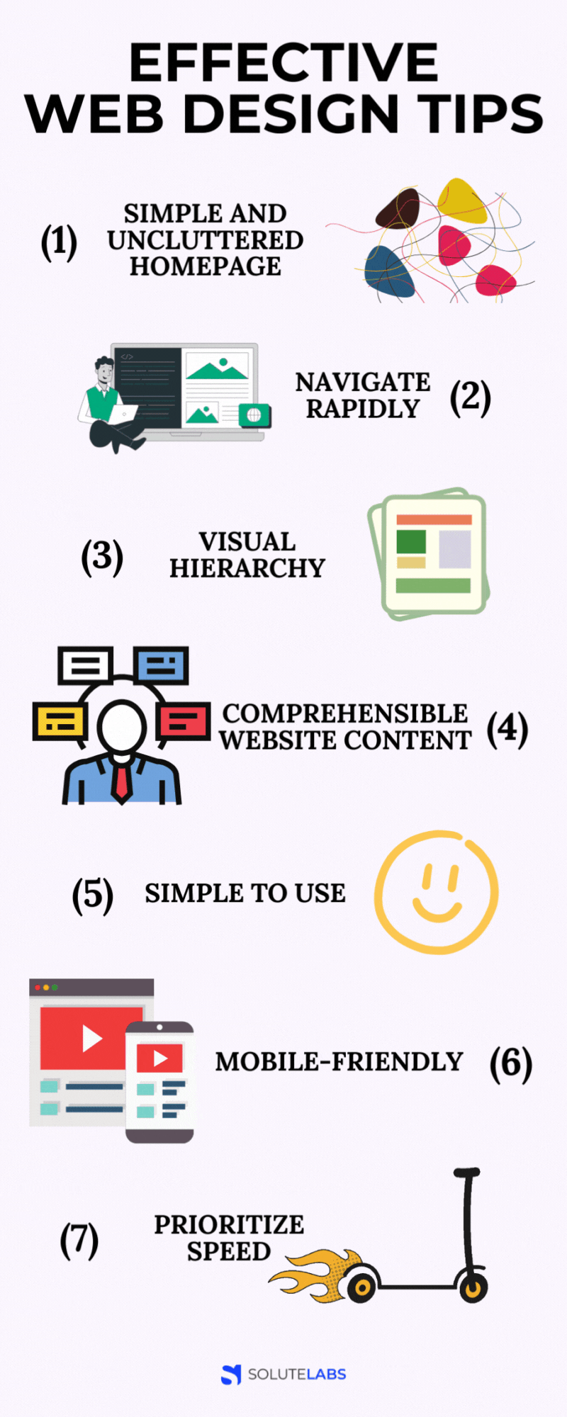
3. Learn about SEO
Whether you use search engine optimization (seo) or pay-per-click (ppc) ads , you typically direct people to your homepage to learn about your business. Once they’re there, they can navigate your website to learn more in-depth information. However, the homepage is an initial representation of your brand, so it’s a useful resource to inform leads about your company. It is important that you design a homepage that is simple but effective. You don’t want to overwhelm your visitors with an abundance of information. If your website is too busy, you’ll deter leads. Your homepage should include elements that interest your audience. 7. Test and iterate don't expect your first design to be perfect. Test your website on different browsers and devices to identify any issues. Gather feedback from friends or peers and be open to making improvements. 8. Learn from others study websites you admire. Look for inspiration in web design galleries and blogs. Don't copy, but rather learn from successful designs and adapt them to your unique style. 9. Seo basics learn the basics of search engine optimization (seo). Properly optimizing your website will help it rank higher in search engine results and attract more visitors. 10. Stay updated the
read more →
Get in touch with us
Before you design your interface, you need to define how people will use it. With the increasing prevalence of touch-based devices, it’s a more pivotal concern than you might think. Just look at tinder: the app’s user experience is literally defined by the ease and impulsivity of a simple swipe. People use websites and apps in two ways: directly (by interacting with the interface elements of the product) and indirectly (by interacting with ui elements external to the product). Examples of direct interactions: typing into a form field drawing on a wacom tablet who your users are and what devices they use should deeply inform your decisions here. Well, now isn't it time you thought about redesigning your site? not just because the competition is get ting better but also thanks to ever-changing web trends. Designing websites that work well and keep up with the changes is what we do best. So, get in touch with us and let us help you with get ting a new website tailored to your needs. Faqs. https://en.wikipedia.org/wiki/Logo How do you research companies you just heard about? chances are – you immediately google their business and visit their website. What’s your first thought
read more →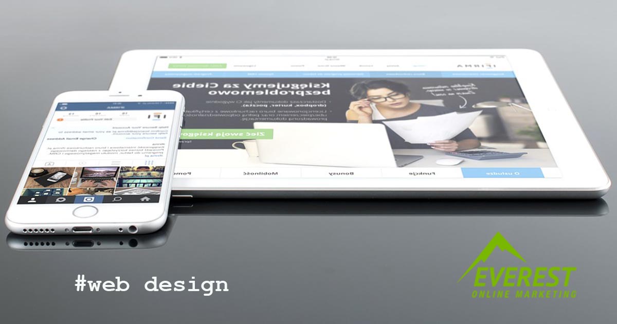
10 Reasons for Slow Website Loading
A slow website can quickly become your worst enemy, often making it impossible to keep prospects on board and nudge them closer to the point of purchase. Like it or not, today's savvy, seasoned site visitors expect websites to load fast, and if your homepage or blogs aren't popping up quickly, they're likely going elsewhere to find what they need. In other words, a website's loading time is an important, if not essential , part of any practical and responsive design effort. It has an indelible impact on the visitor experience and, ultimately, your ability to convert. Understanding how fast your pages load and how to optimize those loading times isn't just one of those website design tips you can gloss over or ignore. It is important to consider mobile devices when designing a website. Ensuring your website is optimized for mobile can greatly enhance the user experience and make it more accessible for your visitors. A responsive design adjusts the website’s layout automatically according to the screen size of the device used. Additionally, using larger text and buttons can make it easier for users to navigate your site on a smaller screen. Also, keep in mind the loading
read more →
30 Website Design Tips to follow in 2023
Great-looking design is based on the tiniest details. These details can cause a great deal of problems for beginner designers. Failing to follow the rules can ruin any landing page, leaving your brand looking unprofessional and even cost you conversions. Fortunately, there are hacks you can use to improve your design piece before you deploy your startup’s website. You know some designs that look ok, but just feel sliiiightly off? this ebook will help to fix them. Best part? it’s free! download here these 20 tricks will save them. Let’s check them out. Btw, i’ve written about common web design errors before. Read the post here. There are many devices out there with varying screen sizes. No matter how someone is accessing your web design, it should offer a similar experience no matter what it’s being viewed on. Instead of putting a huge amount of effort into overly complex animations and hover effects that may not work on every device, it’s better to spend that time improving ui and ux for everyone. Following the tenets of responsive design means your website will be user-friendly and offer an optimized experience across desktop and mobile devices. To learn more, check out our course material “ intro
read more →